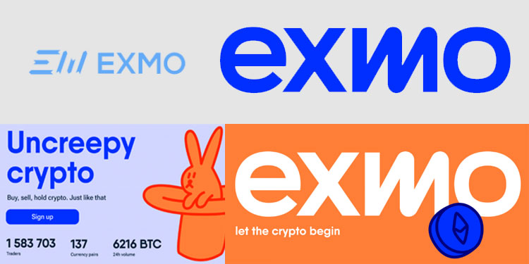
EXMO, a crypto exchange platform operating since 2014, announced this week a rebranded visual identity with includes a new logo, brand colors, and design features. This new branding comes as EXMO continues to grow its crypto platform while also seeking to expand its presence in other jurisdictions.
Some new developments underway at EXMO:
- Soon, users will be able to earn passive income from EXMO’s new staking platform.
- Plans to launch an EXMO crypto debit card.
- Expansion of its services in international markets with the opening of offices in Poland and Lithuania.

The rationale for the re-brand:
“At EXMO, we have a vision of a world where crypto is in every wallet. Hassle-free. We want to achieve this by making crypto as simple and accessible to everyone as possible. And we know that you already appreciate EXMO for offering user-friendly services and helpful support. Also for the opportunity to trade anywhere and anytime, closing deals in just a few taps. Such important changes required a rethinking of our corporate style, which has long needed a massive upgrade. So today we are introducing a new brand identity for EXMO with a completely new visual concept. We are launching a new logo, brand colors, and design elements. Our key design principles are simplicity, boldness, and a pinch of fun. But most importantly, we have changed our logo. Simple and easily recognizable, it represents the humanity of our brand. The logo stands out due to the wavy letter ‘m’ which symbolizes exchange rate charts and also resembles a spring that will launch you into the crypto world.”
– The EXMO Team regarding the re-branding


